1 Image classification
Generate a Landsat 8 composite image, perform a land cover classification of the image, and compare class distribution over elevation in the Netherlands.
1.1 Define input data
First you will need to define the datasets to use. In this exercise you will use Landsat 8 surface reflectance data, AHN elevation data, and vector outlines of the Netherlands and dutch provinces. Copy and paste the lines below to a blank script:
// get landsat data from catalog
var landsat  = ee.ImageCollection('LANDSAT/LC08/C01/T1_SR')

// get only scenes that overlap with NL, have less than 10% cloud cover, and
// fall in the period 2015-2017
var nl      = ee.FeatureCollection('users/philipkraaijenbrink/dpg-workshop/rijksgrens_nl')
var landsat = landsat.filterBounds(nl)
                     .filterDate('2015-01-01','2017-12-31')
                     .filter(ee.Filter.lte('CLOUD_COVER', 10))

// select subsat of image bands and rename them for easier reference
// first select band subset, then loop over images in collection and rename the bands
var landsat = landsat
  .select(['B2','B3','B4','B5','B6','B7','B10'])
  .map(function(x){return x.rename(['blue','green','red', 'nir','swir1','swir2','tir'])})
To get a quick cloud free composite of the filtered Landsat 8 image collection, use a median reducer to generate a single composite image whose pixels comprise the median value of the collection. Using the median makes sure that the cloud pixels are not selected because they are always close to the maximum values.
1.2 Obtain training data
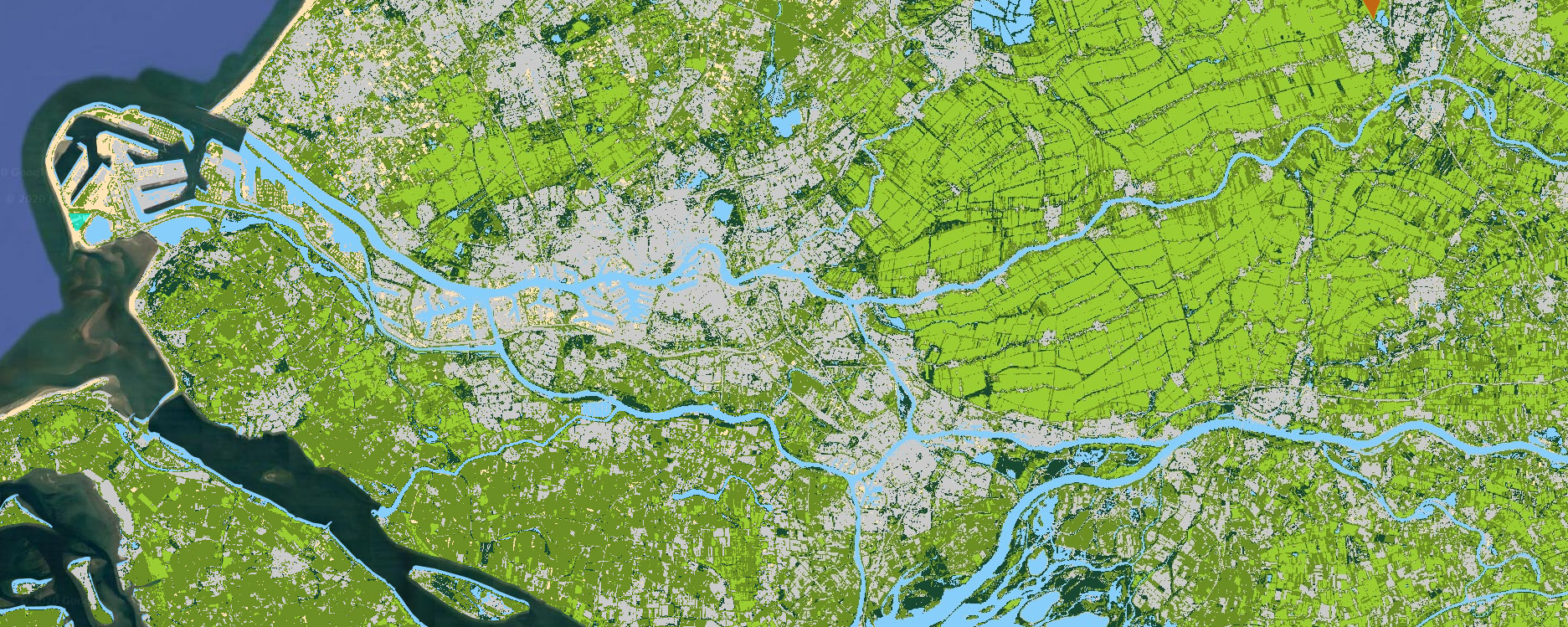
Visualize the data using Map.addLayer(), similar to example code on the previous page. Select a band combination that clearly shows the different land cover types.
To perform classification of the composite image you first need to define training data. This is performed by drawing polygons on the image to sample pixels of a land cover class. In this exercise you will classify the following classes: grassland, forest, water, built-up, bare, cropland
Draw polygons for each of the land cover classes using the drawing tools of Earth Engine (in the top left corner of the map). Do not make the polygon too large and try to limit contamination by pixels that are not supposed to be part of the class, e.g. do not let the built-up polygon partly cover a park.
For each class, you should generate a new layer. In the layer settings (accessible via the gear icon that appears when hovering over the layer) give the layer a name, set the import type to ‘feature’ and add a property “class”. Set the class value for each cover type to a unique numerical value (0 to 5). If necessary, there can be multiple polygons per class. Don’t mind the colors for now, you will assign them in a later stage.
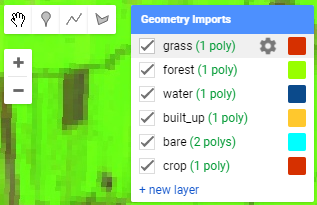
Figure 1.1: Drawing tools and layers currently drawn.
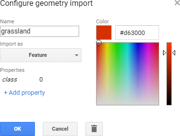
Figure 1.2: The geometry settings dialog.
When you have created the polygons for all classes, combine them into a feature collection using the following code (check whether the layer names match yours).
1.3 Classify image
Using the polygons, we will now sample pixels from the image and use them as training data for the classification algorithm. You will use a simple minimum distance classifier, but there are many more advanced options available. To generate the classified image use:
// selection of bands to use for classification algorithm
var bands   = ['green','red','nir','swir1','swir2']

// sample pixels from the image using the regions
var training = satimg.sampleRegions({
  collection: sampleregs,
  properties: ['class'],
  scale: 30
})

// define classifier and train with the samples
var mdmodel  = ee.Classifier.minimumDistance('euclidean')
var trained  = mdmodel.train(training, 'class', bands)

// apply classifier to the image
var classimg = satimg.classify(trained)
Define a list with class names, values and display colors to use for mapping and charting:
// lists with class names, values and colors (for colors use hex RGB or html5 color names)
var classlab = ['Grassland','Forest','Water','Built-up','Bare','Cropland']
var classval = [0,1,2,3,4,5]
var classcol = ['YellowGreen', '184930', 'LightSkyBlue', '#cacaca', 'Moccasin', 'OliveDrab']
Add the classification to the map using:
If you would like, you can add a quick legend to the map using this predefined function:
var lg = require('users/philipkraaijenbrink/tools:legends')
lg.classLegend(classval, classlab, classcol)
Evaluate the classification accuracy. Has it performed well? If not, change your polygons and/or add extra.
1.4 Visualize using charts
To get information about the class distribution in the Netherlands, generate a barchart showing approximate area per class. This can be done using the following code:
// chart that shows class area distribution
var nl = ee.FeatureCollection('users/philipkraaijenbrink/dpg-workshop/rijksgrens_nl')
var chart = ui.Chart.image.byClass({
  image: ee.Image.pixelArea().multiply(1e-6)        // pixel area in km2
            .addBands(classimg.rename('classification')),
  classBand: 'classification',
  region: nl,
  reducer: ee.Reducer.sum(),
  scale: 30*30,
  classLabels: classlab,
})
chart.setOptions({title:'Area per class', hAxis: {title: ''}, vAxis: {title: 'Area (km2)'},
                 colors: classcol})
     .setChartType('ColumnChart')
print(chart)
To get a sense of class distribution with elevation in the Netherlands, first extract elevation bands from the detailed 0.5 m resolution elevation model Algemeen Hoogtebestand Nederland (AHN):
// get equidistant elevation bands from AHN for charting
var elev = ee.Image('AHN/AHN2_05M_INT')     // get AHN dataset from catalog
var stepping  = 1.0                         // elevation step size
var elevsteps = ee.List.sequence(-5,50,stepping)     // get steps in range
var itr = ee.List.sequence(0,elevsteps.length().subtract(1),1)  // iterator list to loop over
var elevbands   = ee.ImageCollection.fromImages(itr.map(function(i){  // loop over iterator i
  var elevthres =  ee.Number(elevsteps.get(i))                        // get elev_i
  var elevband = elev.lte(elevthres).and(elev.gt(elevthres.subtract(stepping))) // elev band
  var onlyband = elevband.updateMask(elevband.eq(1))         // mask everything but true
  return onlyband.set('system:index',ee.Number.parse(i).format('%04d'))  // set image index
}))
Make a chart of the elevation bands that evaluates the area per class per elevation band:
// make chart of pixel count per class per elevation band
var chart = ui.Chart.image.byClass({
  image: elevbands.toBands().addBands(classimg.rename('classification')),
  classBand: 'classification',
  region: nl,
  reducer: ee.Reducer.sum(),
  scale: 30*30,
  classLabels: classlab,
  xLabels: elevsteps.getInfo(),
})
chart.setOptions({title:'Land cover with elevation', hAxis: {title: 'Elevation (m)'},
                lineWidth: 2, pointSize: 0, colors: classcol, isStacked: 'absolute'})
     .setChartType('AreaChart')
print(chart)
To determine the fractional coverage of each elevation band, change the string absolute to relative or percent in the setOptions() function in the code above.
You can also summarize images for every region in a vector dataset using ui.Chart.image.byRegion(). For example class area per province in the Netherlands:
// make a chart for class distribution in each province
var prov = ee.FeatureCollection('users/philipkraaijenbrink/dpg-workshop/provincies_nl')
var sepclass = ee.Image(ee.List(classval).iterate(
  function(x,y){return ee.Image(y).addBands(classimg.eq(ee.Image.constant(x)))},
  ee.Image().select()))
var chartlab = []; classval.forEach(function(val,i){chartlab.push(val+' '+classlab[i])});
var chart = ui.Chart.image.byRegion({
  image: sepclass.rename(chartlab),
  regions: prov,
  reducer: ee.Reducer.sum(),
  scale: 30*30,
  xProperty: 'provincien',
}).setChartType('ColumnChart').setOptions({colors: classcol, isStacked: 'percent'})
print(chart)